
RideAlike Onboarding Experience
RideAlike is a Canadian mobility company that offers a vehicle-sharing marketplace, helping owners turn their depreciating assets into revenue while making shared mobility accessible. As a UX Researcher, I evaluated the onboarding flow, identified pain points, and collaborated with the team to recommend solutions for a smoother, more intuitive user experience.
Type: Internship
Team: 7 Members
UX Research
Timeline: 12 weeks
Activation Event
Heuristic Evaluation

Led research to deliver actionable recommendations to boost task completion, reduce drop-offs, and enhance usability.
from a Project Management Intern to UX Researcher
CONTEXT
I joined RideAlike as part of my Seneca Internship program. But I saw a bigger opportunity.
I did UX research along with my team members to fix the high drop-off rates during the mobile onboarding process by recommending solutions.
What started as a project management role quickly turned into an opportunity to enhance user experience and boost conversions. 🚀

As a UX Researcher, my mission was clear: figure out what was causing users to drop off at the onboarding stage and how to fix it. The data was telling us a story—high drop-off rates, users struggling to complete onboarding, and accessibility issues that alienated a few groups. It was clear we needed to do something about it.
Discovering the Problem
RideAlike’s Complete Onboarding Experience (From L to R)


Laying the Foundation for Research
Understanding the problem space
Our goal was to pinpoint the biggest pain points in the RideAlike onboarding, figure out what's blocking user engagement, and find the changes that would make the most difference.
setting up research goals to have a clear vision
Our research focused on improving the onboarding process by addressing key user challenges and aligning with business goals.
Identifying pain points and drop-off stages in the onboarding flow.
Analyzing the impact of usability and accessibility on completion rates.
Proposing changes to enhance intuitiveness and align with business goals like retention and time-to-first-action.
The Lightbulb Moments
To get to the root of the problem, I conducted usability testing and heuristic evaluations. We talked to users, listened to their frustrations, and watched as they navigated the app. The feedback wasn’t surprising—unclear instructions, inconsistent navigation, and no real-time feedback were making the process harder than it needed to be. One of the biggest “aha moments” came during a usability session.
A user said, “I’m not even sure if I’m doing this right, and I don’t want to start over.”
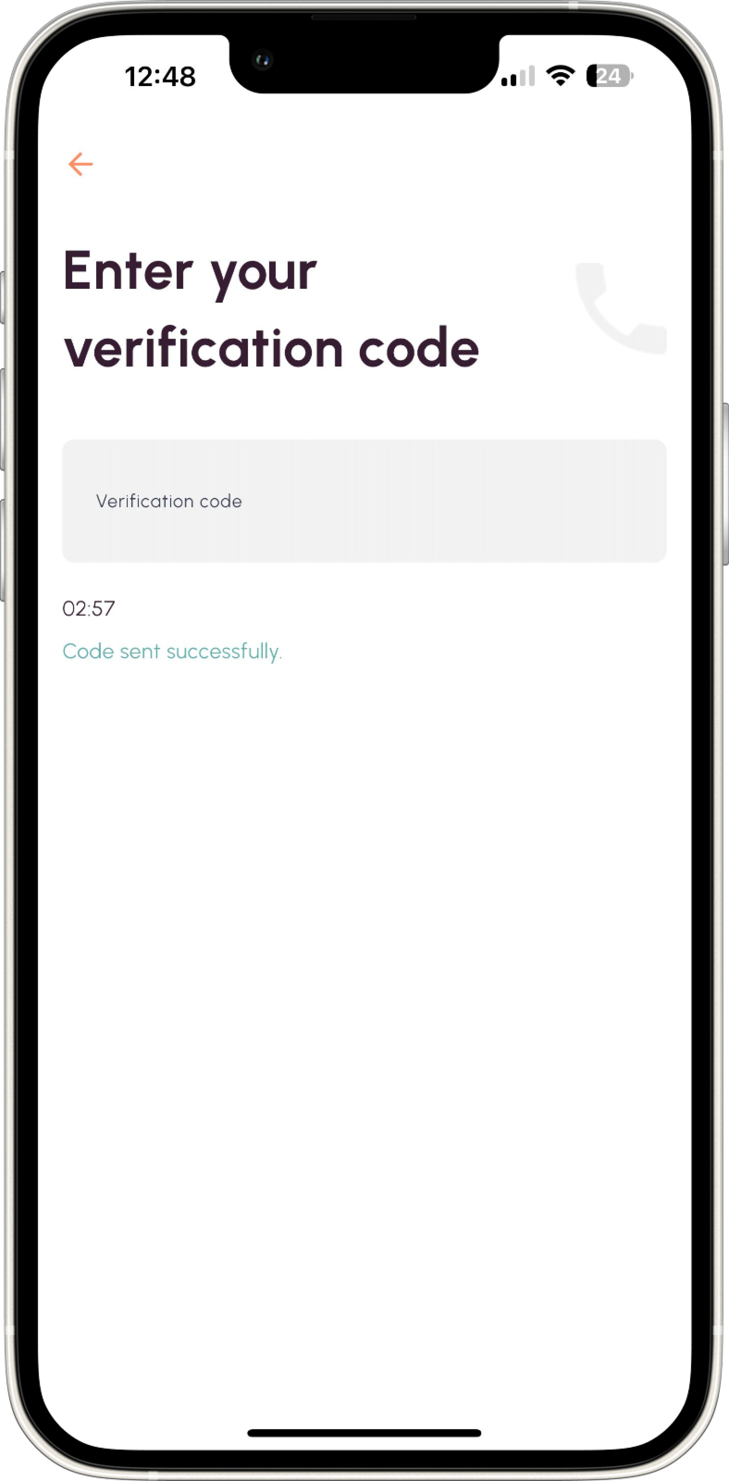
Another user said “The text is too small, I can’t even read what’s written.“
That stuck with me. It was a reminder that even small friction points, like unclear progress or poor feedback, can have a huge impact on the user’s trust and motivation.
Majority of the users struggled with button text legibility due to poor contrast ratios and found instructions hard to read due to small fonts, highlighting a critical accessibility gap.
Heuristic Evaluation
We conducted a heuristic evaluation of the entire onboarding flow, systematically identifying usability issues to uncover friction points and areas for improvement.
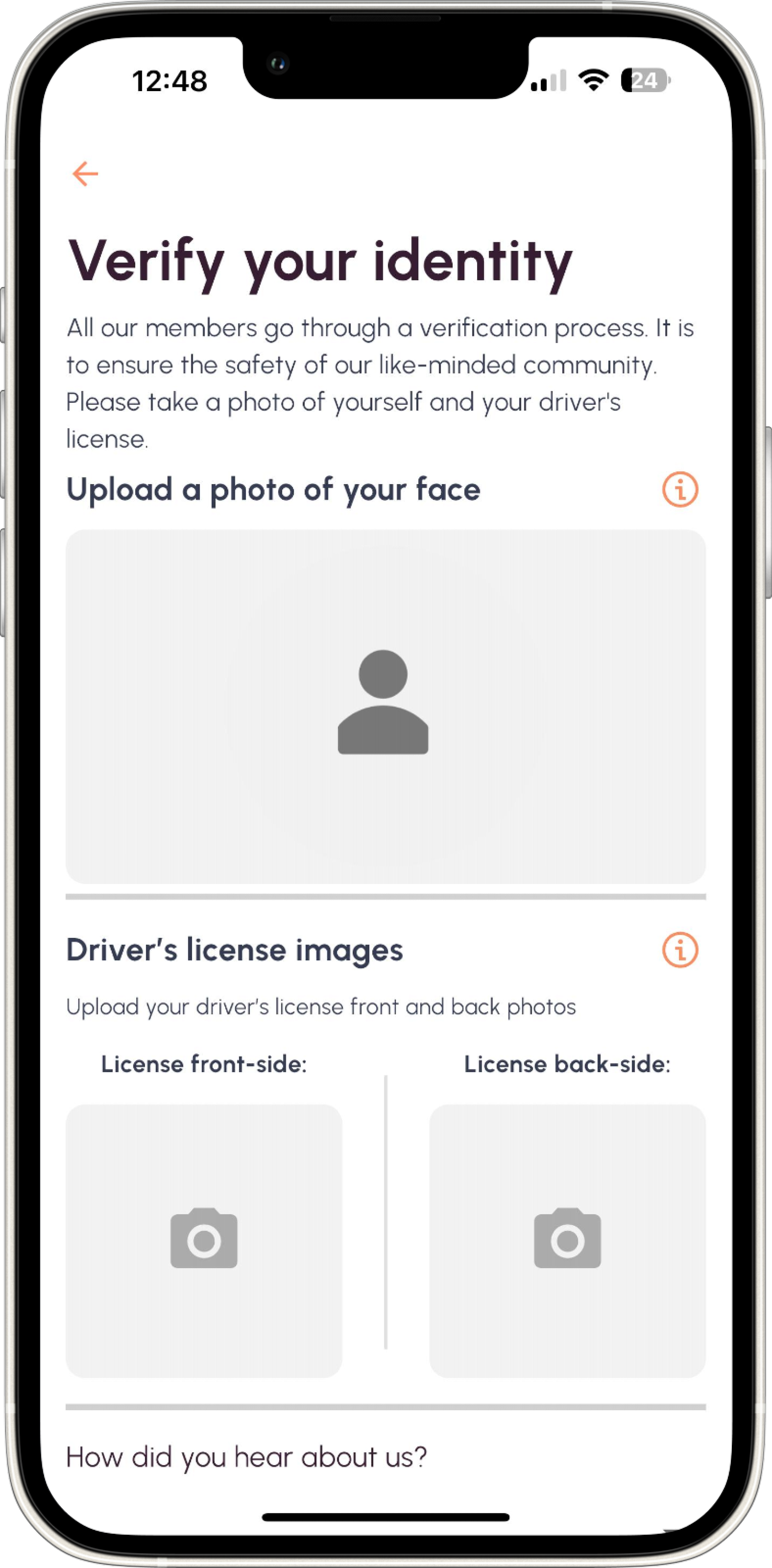
1> Clarity of labels: The "Create Account" text lacked precision, leaving users uncertain about its purpose.
2> Feedback visibility: Hiding the CTA button until password validation disrupted user flow and caused confusion.
3> Discoverability: The off-screen survey drop-down failed to meet accessibility expectations, leaving users unaware of its presence.
4> Information hierarchy: Long microcopy overwhelmed users, making the next steps unclear.
5> Personalization mismatch: Displaying "John Doe" post-registration disoriented users, breaking trust in the experience.
6> Interaction affordance: Inactive tab bar menus due to non-verification hindered navigation, leaving users puzzled.
A> Insufficient contrast: White text on the orange button fails WCAG AA and AAA standards, making it hard to read.
B> Readability: Small font size does not meet accessibility guidelines, reducing legibility on mobile screens.
C> Visual hierarchy: Thin font weight lacks sufficient emphasis, failing to communicate actionable elements clearly.
D> Tap target size: Small font and insufficient spacing hinder touch usability, violating mobile accessibility best practices.
E> Perceived affordance: Text styling does not indicate interactivity, creating uncertainty for users.
Discovering the Disconnect
Turning Insights into Action
To ensure our research was clear and impactful, we visualized key insights using Affinity Mapping, User Journey Maps, Personas and Drop-off Heatmaps.
Playing Back the Research to the team
I didn't just present numbers—I told a story. Using concise storytelling and interactive workshops. I Walked the team through user pain points with real-life scenarios. Created an “Onboarding Experience Scorecard” to highlight key problem areas. Facilitated discussions with stakeholders to align on design priorities.
Key Insights
Through usability tests and interviews with 20 participants, patterns emerged:
32% users abandoned the onboarding process due to crashes and unclear instructions.
41% users with small devices felt the experience was inaccessible, with no support for text resizing.
68% of users completed onboarding, but most took longer than 3 minutes which is above industry standard.
These insights underscored the need for immediate intervention to improve user retention and satisfaction.
Crafting the Recommendations
Based on our research, we proposed key improvements to streamline the onboarding experience. Simplified registration by reducing form fields and enabling social logins could make sign-ups faster and frictionless. Enhanced feedback mechanisms, like real-time validation and success messages, would provide users with clear guidance.
To ensure inclusivity, we recommended accessibility improvements, such as better color contrast, larger tap targets, and screen reader compatibility. Lastly, refining microcopy with clear, action-oriented language could help users navigate onboarding with ease. 🚀
-
Add a progress bar to visually guide users through each step of the onboarding process, reducing uncertainty.
Rewrite all form instructions using plain language to make them easier to understand.
Implement an auto-save feature so users can resume onboarding where they left off, without losing progress.
Pre-fill fields like language selection using system settings, eliminating unnecessary steps for users.
Reduce cognitive load by grouping related fields and ensuring the layout is clean and minimalistic.
-
Introduce real-time validation for document uploads, immediately notifying users of errors (e.g., file size)
Replace generic error messages with actionable suggestions, such as “Ensure your file is under 5MB and in PNG or JPG format.”
Provide visual feedback (e.g., checkmarks or progress indicators) for successfully completed steps.
Add a system to confirm uploads and actions, giving users confidence their input was received.
Display clear confirmation messages after completing a step, reinforcing progress.
-
Redesign buttons with high-contrast colors to improve visibility, especially in low-light conditions.
Increase font sizes across the app, ensuring all text is legible without straining the eyes.
Maintain a minimum contrast ratio of 4.5:1 for all text and interactive elements.
Use visual indicators, like underlines, to distinguish links and other actionable items.
Ensure all tappable elements, like buttons, meet a minimum touch target size of 48px for ease of use.
-
Add motivational phrases, such as “You’re almost there!”, to encourage users during longer tasks.
Use a friendly, approachable tone that aligns with the RideAlike brand voice throughout the app.
Provide step-specific guidance for complex processes, breaking down instructions into smaller, manageable steps.
Replace vague instructions like “Driver’s license images” with specific prompts, such as “Upload your Driver License”.
Create value-driven messages at key moments, like, “Completing this step unlocks faster rentals!”
The Projected impact of our recommendations
While implementation was still in the hands of the team, our recommendations laid the foundation for significant improvements:
✦ Stronger User Engagement – A smoother onboarding experience meant users felt more confident navigating the app, reducing frustration and increasing retention.
✦ Higher Completion Rates – Clearer instructions and a more intuitive flow made it easier for users to complete the onboarding process without hesitation.
✦ Faster First Actions – With better guidance and real-time feedback, users could move seamlessly from onboarding to their first booking or vehicle listing without confusion.
Learnings
Small Design Details Have a Big Impact – Minor changes, like increasing font sizes for readability or improving button contrast, can make a major difference in accessibility and user engagement. Designing with inclusivity in mind benefits all users, not just those with accessibility needs.
User-Centered Solutions Drive Business Success – Aligning usability improvements with business goals, such as retention and conversion rates, creates a win-win scenario. When users have a seamless experience, they are more likely to stay, engage, and trust the platform.