RemoteFit
How we optimized physical health, mental well-being, work-life balance and overall productivity for remote workers.
Project Context
Remote workers encounter difficulties in managing mental fatigue and stress as remote work continues to redefine the workplace in the post-pandemic world.
Our Work-From-Home Wellness App addresses these challenges by providing solutions that enhance work-life balance and support overall well-being.
Our team, consisting of Het Shah, Mahsa Rad, and myself, embarked on this project during a three-day design hackathon event where we secured first place among 20 groups.
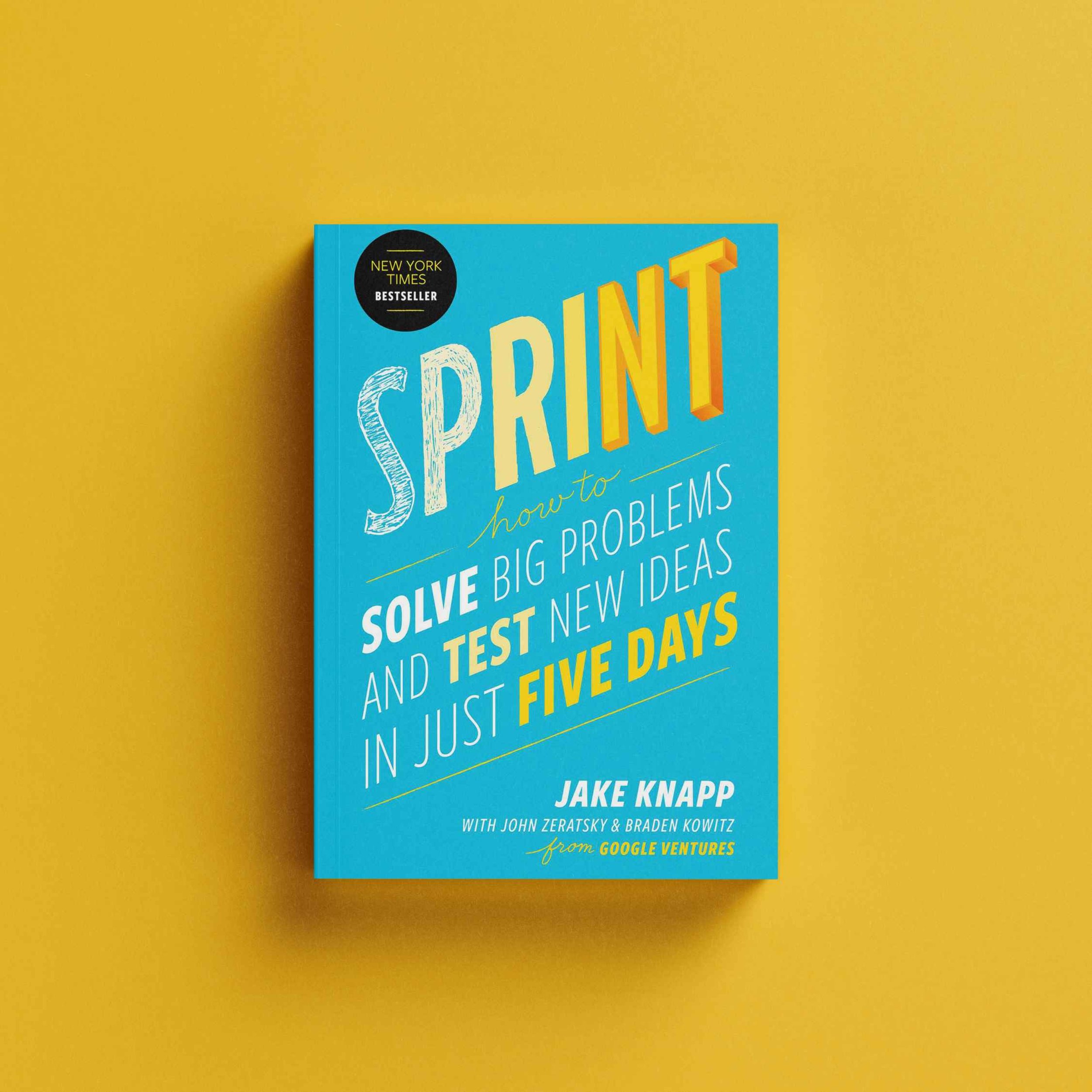
Inspired by the book "Sprint: How to Solve Big Problems and Test New Ideas in Just Five Days", I applied its methodology to our three-day designathon project.
MY ROLE
Facilitator, UXR, Prototyping
DURATION
March 29th-31st, ‘24
Figma, Zoom, Mockups App
TOOLS
FORMAT
Google Design Sprint

The Problem
Remote workers experience challenges such as difficulty disconnecting from work, leading to burnout and decreased well-being.
Design Sprint Process ⏩
Although we didn't have five days, we divided our three-day design sprint into five stages to fit the traditional sprint format: Understand, Ideate, Decide, Prototype, and Test.
We mapped out the problem and identified a focus area, sketched competing solutions, made decisions to create a testable hypothesis, developed a realistic prototype, and gathered feedback from real users.

DAY 1
DAY 1
Phase 1: Make a Map & Choose a target 🎯
In the first phase of our design sprint, I facilitated the process by guiding the team to understand the problem, establishing a clear focus on the challenge, identifying remote workers' pain points, and mapping key challenges and opportunities.
PLANNED KEY ACTIVITIES
The key tasks we outlined at the kick-off meeting were:
To create a detailed timeline, assign roles, and set a long-term goal.
To conduct user research with our target users to quickly gain insights on their problems.
To synthesize the data and list key insights from the collected information.
TIMELINE
We structured Day 1 into three distinct phases as follows:
LONG TERM GOAL
The long-term goal for the app is to become a leading tool for remote workers, with the aim of achieving widespread adoption.
Understand the lifestyle habits of remote workers.
Identify work-related frustrations.
Gain deep insights into their social and mental well-being.
GOALS FOR RESEARCH
USER RESEARCH
For our primary research, we used Google Forms, Instagram polls/surveys, and phone interviews with remote workers to better understand and empathize with our target users.
For our secondary research, we reviewed several online articles including “The Impact of Remote Work on Mental Health: An In-depth Analysis”, “Is remote work worse for wellbeing than people think?” and “5 Common Problems Plaguing Remote Workers And What To Do About Them“.
We identified patterns and distilled the research data into three key themes.
ORGANIZING RESEARCH DATA INTO KEY THEMES

DAY 2
DAY 2
Phase 2: Sketch Competing Solutions ✏️
As a facilitator, I encouraged open sharing of all ideas, emphasizing the value of collective creativity. I guided productive brainstorming and sketching sessions, led discussions to refine and prioritize concepts, and presented top ideas for team feedback. To set the tone, I shared how some of the best ideas in past projects came from those who weren’t skilled artists.
During the ideation phase, we brainstormed app concepts, created low-fi wireframes, and explored various design inspirations.
TIMELINE
Idea Generation: Using methods like Crazy 8’s and drawing inspiration from existing apps on Mobbin, we quickly generated a wide range of ideas and drew inspiration for features from various mobile applications.
Paper Prototyping: Creating simple sketches helped us visualize and develop concepts from our imagination.
Divide and Conquer: Individual brainstorming led to innovative solutions and it highlighted essential features, such as a mental wellbeing score and stress meter.
WHAT OUR IDEATION PHASE LOOKED LIKE
My Crazy 8s
Mahsa Rad’s Crazy 8s
Het Shah’s Crazy 8s
Phase 3: Decide on the best 💡
As a facilitator during the decision phase, I organized structured dot voting and led discussions to prioritize features based on their impact. We crafted detailed solution sketches and developed a storyboard to effectively outline the user journey and app flow.
TIMELINE
After the Ideation Session in the morning, we structured our day as follows:
KEY TASKS
Setting the Tone: I reminded my team mates that all ideas are welcome to make them feel comfortable.
Anonymous Dot Voting: Prioritization through dot voting helped the team focus on features by impact and feasibility.
Storyboarding: Storyboarding provided a clear visual representation of the app’s user journey and flow.
Solution Sketches: Visualization with detailed sketches and mockups transformed the shortlisted ideas into visual concepts.
Created RemoteFit Storyboard using Storyboards.ai
Created Solution Sketches using the Mockups App
Feature Selection by Impact & Feasibility Map
ALIGNING THE TEAM
-
Dot Voting: We used dot voting, where each team member placed dots on their preferred designs, helping us identify the most popular concepts.
Group Discussion: We discussed the top-voted ideas as a team, considering their feasibility, alignment with user needs, and overall impact.
Consensus Decision: After evaluating the pros and cons of each concept, we reached a consensus on the winning design to move forward with.
-
Open Dialogue: We encouraged open discussions where each team member could express their opinions and concerns.
Focus on User Needs: We grounded our decisions in user needs and project goals, ensuring the best solution aligned with these priorities.
Feedback Decider: Make it clear that the feedback receiver is the decision maker. Whatever feedback is coming the designer’s way, their responsibility is to consider and decide whether to act on it or not.
Facilitated Compromise: As a facilitator, I guided the team towards a compromise by identifying common ground and integrating the strongest aspects of different ideas.
-
Moodboarding: We created a moodboard to finalize the design of the app, drawing inspiration from existing health and wellness apps.
Rationalization: We evaluated the design concepts on the moodboard, focusing on the rationale behind each choice to address roadblocks effectively.
Gamification: We designed the app to be calming and user-friendly, incorporating elements that make it feel more like a game than a typical app in the app store.
These methods enabled us to effectively refine our ideas, visualize the user experience, and align the final concept with our project goals. With a clear direction established, we then started to build the MVP.
Phase 4: Build a realistic prototype 📱
In the prototyping phase, we turned our ideas and sketches into a realistic, functional prototype. This involved developing the onboarding experience, home screen, internal chat, profile screen and navigation for the mobile experience using Figma, preparing the app for user testing.
TIMELINE
While my team members handled the UI design, I focused on developing the prototype and microinteractions, linking all the screens based on the user flow established in earlier storyboarding stage of the project.
THE PROTOTYPE
Finally, our prototype was ready for our testing phase.
milestones for day 2 ✅
Core Functionalities: The prototype included essential features such as activity tracking, wellness check-ins, and social elements.
Development Process: Rapid development and iteration were achieved through efficient prototyping, with key user interactions emphasized to ensure a smooth and intuitive experience, while internal reviews helped identify and resolve issues early.
User Testing Preparation: The prototype was finalized for user testing, incorporating all critical features.

DAY 3
DAY 3
Phase 5: Test with target customers
The final phase involved testing the prototype with real users to gather feedback and validate our design, while also preparing presentation materials for the final pitch to summarize our findings and proposed next steps. Het and I conducted the usability testing interviews, and Mahsa organized the Figma file and created the presentation.
TIMELINE
In the final phase of the design hackathon, we conducted moderated usability testing via Zoom, made minor UI adjustments, finalized the slide deck, and rehearsed the presentation before the big reveal at the design hackathon event.
We progressed from low-fi to high-fi prototypes, conducting one round of usability testing (3 users) due to shortage of time. Feedback was incorporated to refine the design, ensuring the app effectively met user needs and preferences.
USABILITY TESTING
KEY TAKEAWAYS FROM USABILITY TESTING
Flexibility and Customization: Users appreciated customizable work hour reminders but requested even greater flexibility and more options for dashboard customization, including color schemes.
Personalized Insights: There was a strong desire for deeper insights and personalized recommendations derived from mental health metrics, highlighting the need for more tailored content.
Enhanced Collaboration and Communication: While internal chat features were praised for their simplicity, users suggested improvements such as threaded conversations and enhanced collaborative features in task management tools.
User testing provided valuable insights that led to key adjustments, enhancing the prototype's usability. Early feedback confirmed the app's effectiveness in addressing remote workers' wellness challenges.
The Solution
1. Mental Health Metrics
Track and monitor your mental well-being with real-time insights and personalized recommendations
2. Scoring System
Evaluate your overall wellness with a comprehensive scoring system that reflects your progress and areas for improvement.
3. Mindfulness Resources
Access a curated library of mindfulness exercises and techniques to help you stay calm and focused.
Outcome 🥇
RemoteFit offers an all-in-one solution to optimize remote work by addressing key challenges and enhancing well-being, productivity, and work-life balance.
The app’s development was guided by rigorous research, thoughtful design, and user-centric features, aiming to empower remote workers in both their professional and personal lives.
Our presentation, which was highly praised by the panelists, secured a first-place win and showcased RemoteFit’s potential to make a significant impact on the future of remote work.
What We would do differently 📖
Allocate More Time for User Testing: We would dedicate additional time to conducting user tests to gather deeper insights and validate our design decisions more thoroughly.
Adopt a Design System: Implementing a design system would streamline our process, ensuring consistency and saving time during prototyping.


